Your Super is helping users improve their health with the power of (super) plants. They're a direct-to-consumer ecommerce company selling super food supplements.
Brandless is redefining what it means to be a brand through transparency, community building, and putting people first.
Year
2021
Skills
UI & UX
Wireframing
Prototyping
They have a private Facebook group with over 54,000 members so they have a large base of dedicated users but a clunky subscription UX that made it hard for users to manage. My colleague and I worked with Your Super to revamp their subscription program into an intuitive and delightful experience.
They make 'better-for-you' quality products more widely accessible and affordable for everyone. Life, liberty, and the pursuit of fairly priced everything.
As a Brand Designer at Brandless, my goal was to communicate the value and humanity of Brandless to foster connection & accessibility.
UX research
We started with feedback from current users & product managers then conducted a competitive analysis to define the biggest pain points with the old UX. A few key areas of opportunities became clear:
Lacking ability to upsell products to subscription in cart or checkout
Too many steps from login to edit order
The ability for a user to add one-time product was unclear and underutilized
Users were not aware of ability to swap products
User not aware of active subscription vs upcoming subscription
No option to upgrade to subscription in cart
Inconcistancy with subscription labeling & upsell headers. It also repeats upsell twice.
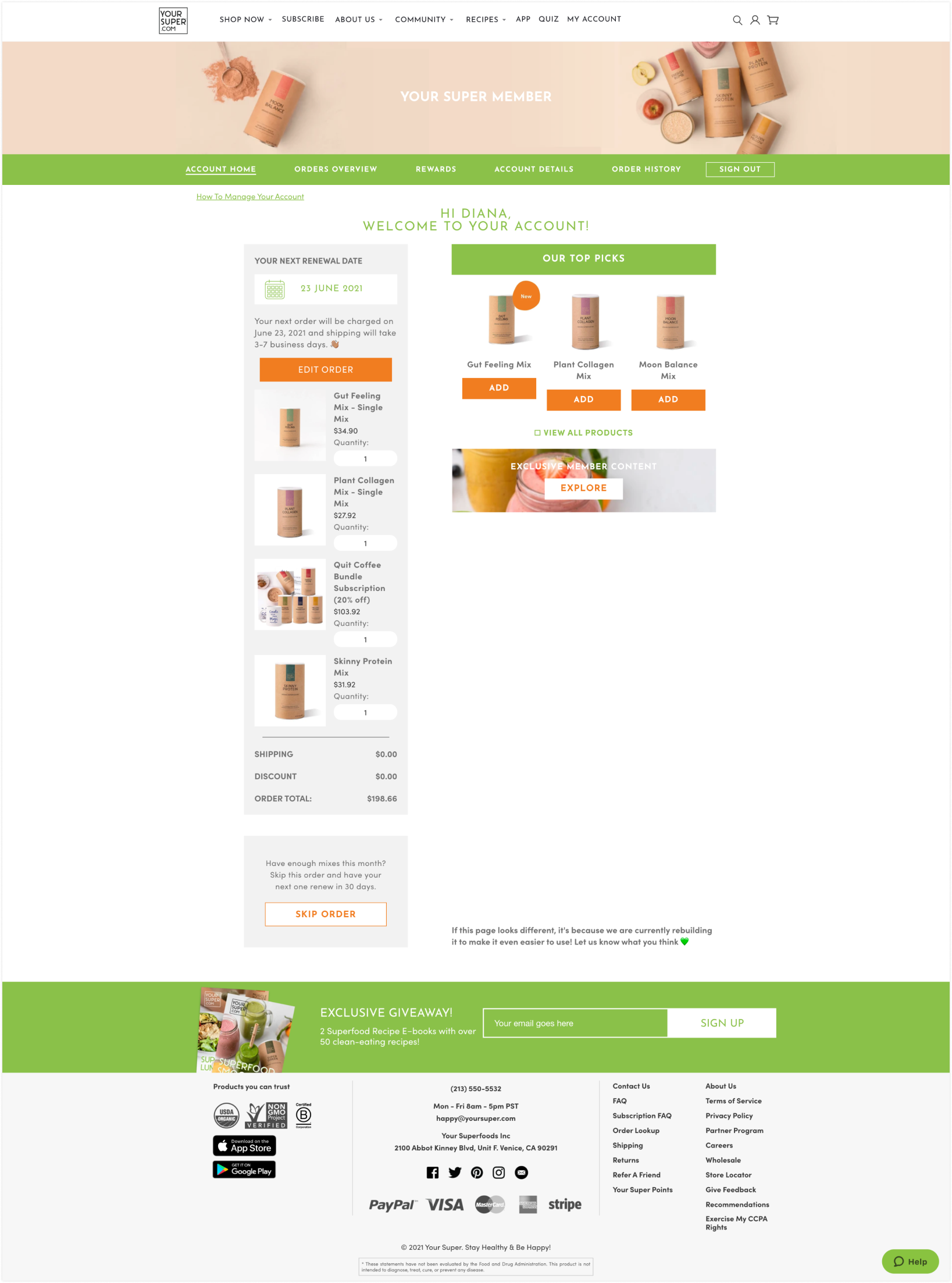
Account dashboard: user cannot make any edits, must click 'edit order'. Tons of underutilized white space and poor informational architecture.
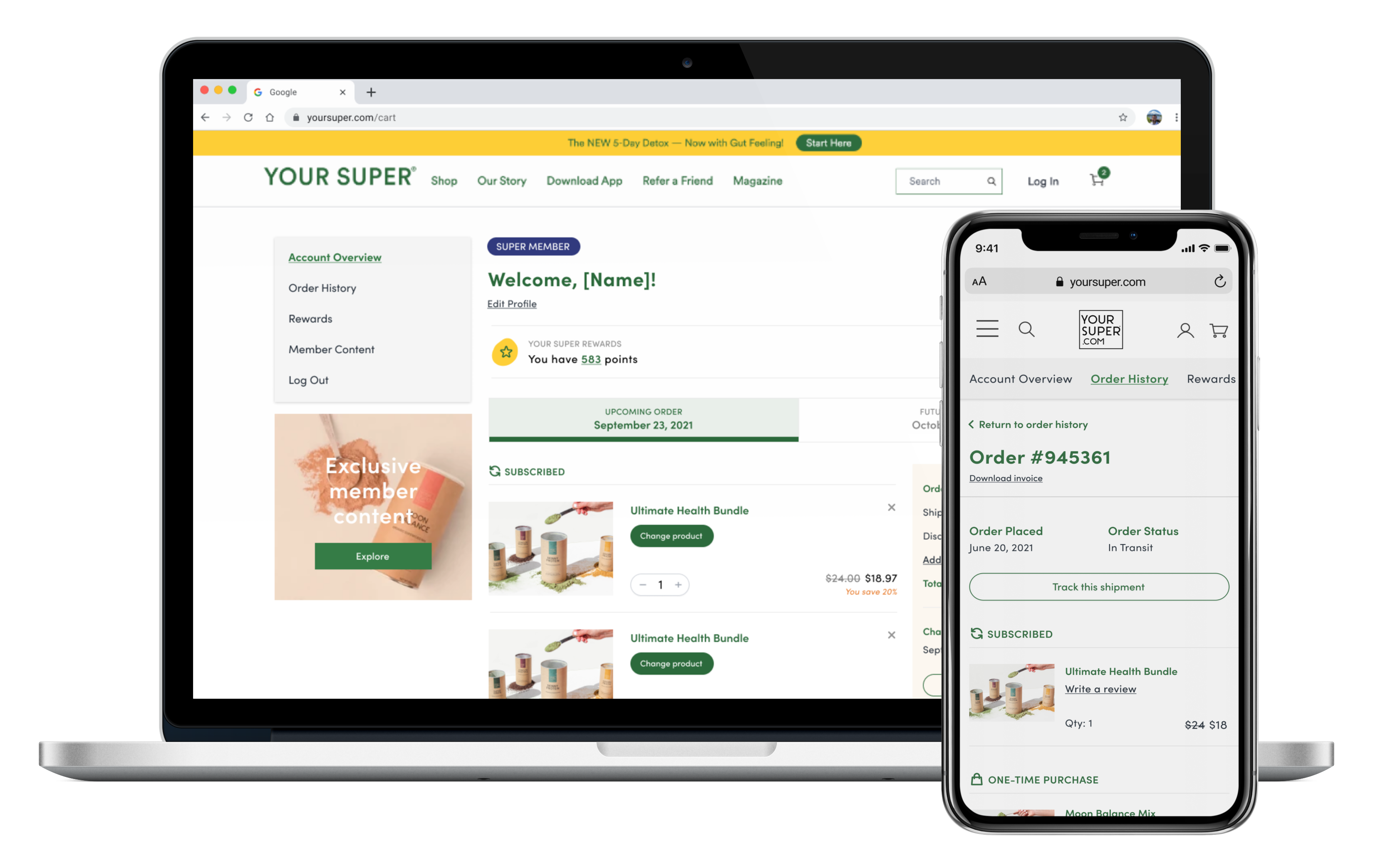
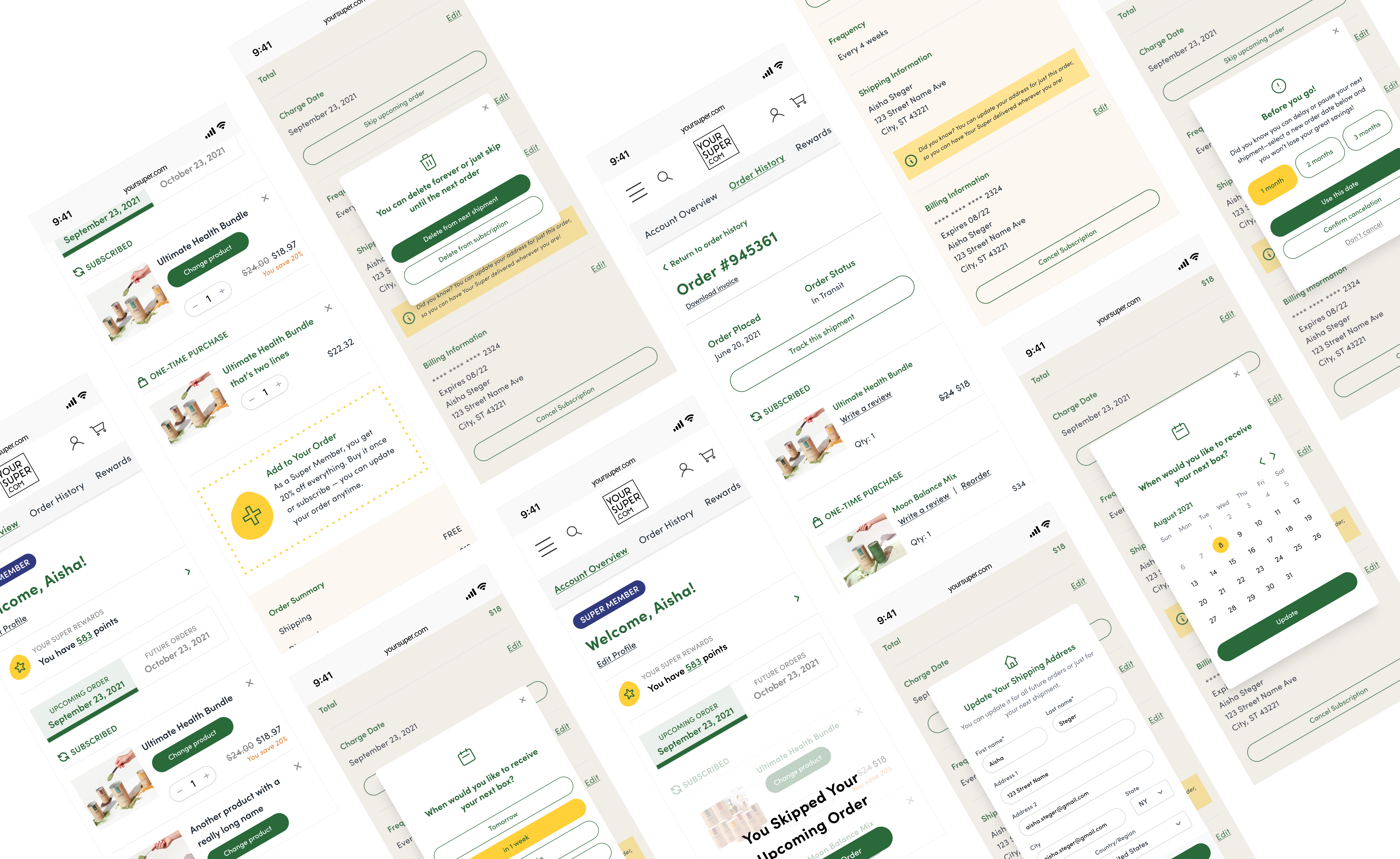
Account Dashboard
This dashboard was the main focus of the subscription overhaul, as the main goal was to help current subscribers adjust their plans more easily. I opted to move the subnavigation to the left rail as many users were missing it as the green bar below the image. Product tiles are wider with larger images to make better use of space. Users can edit their subscription from the dashboard versus having to click edit and be sent to a very similar page.
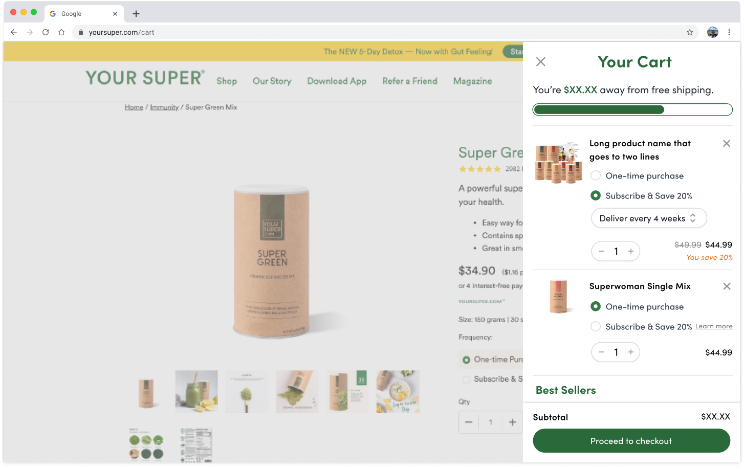
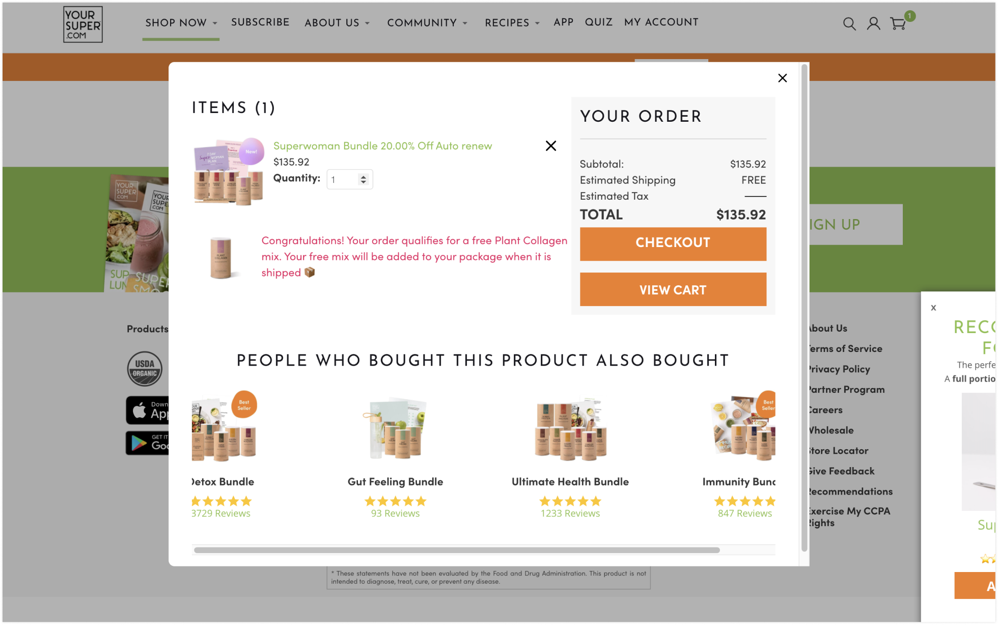
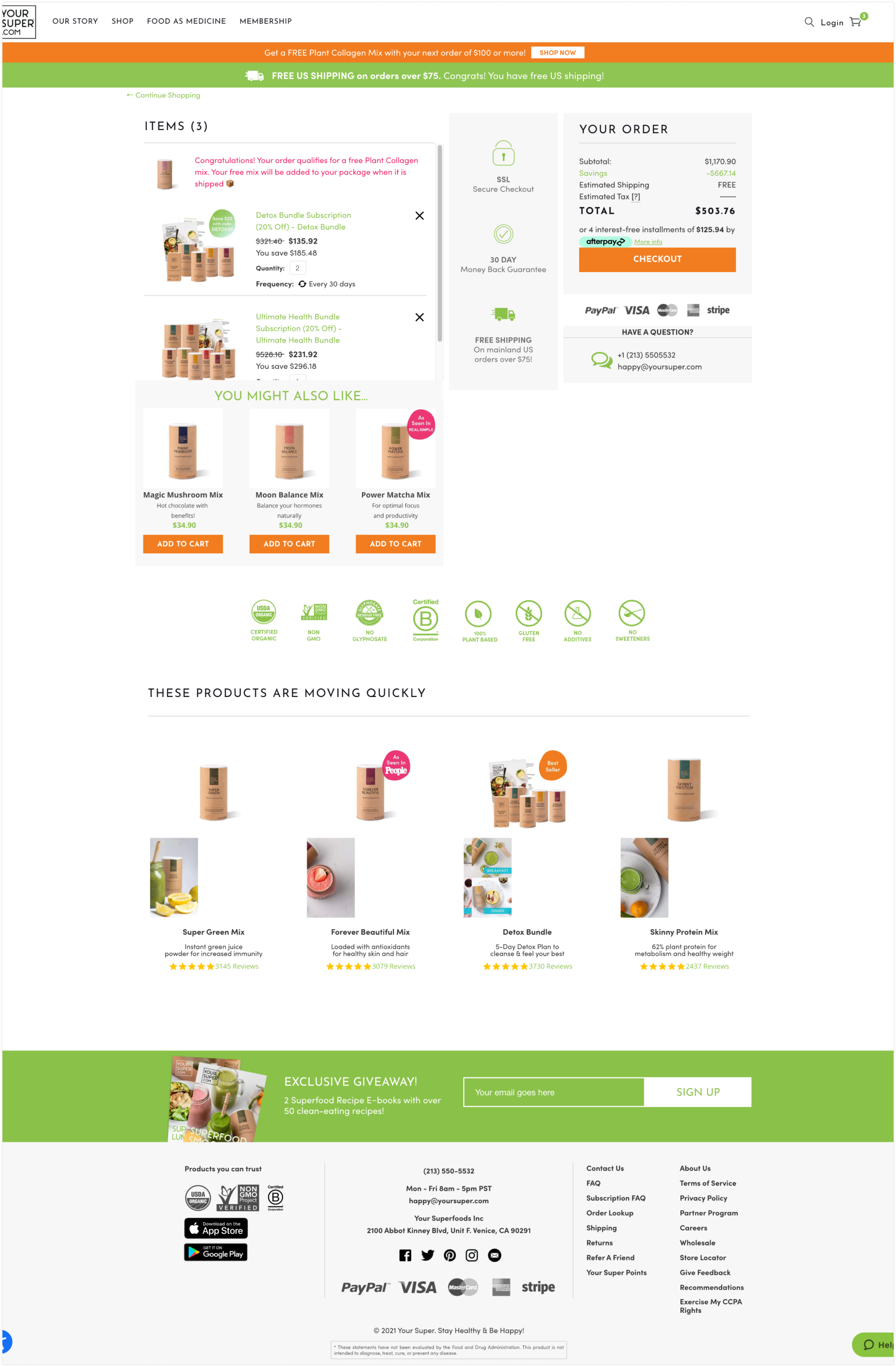
Cart
The cart was originally an iframe modal but I opted for a side drawer so it's less intrusive to the user. I also added a radio button below the product title where users could switch to subscription and choose their frequency. Lastly, a free shipping threshold progress bar was added to boost AOV (average order value).
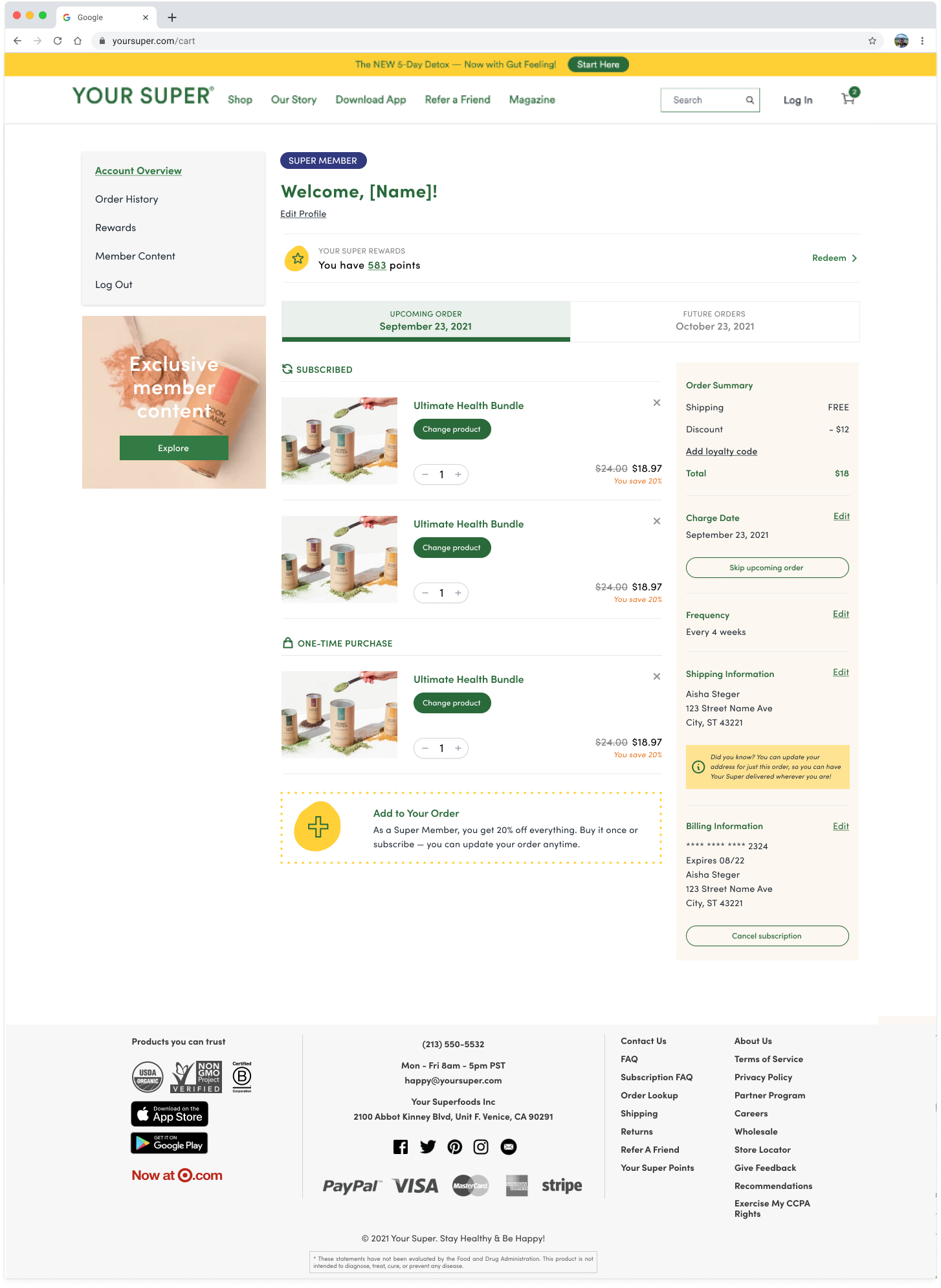
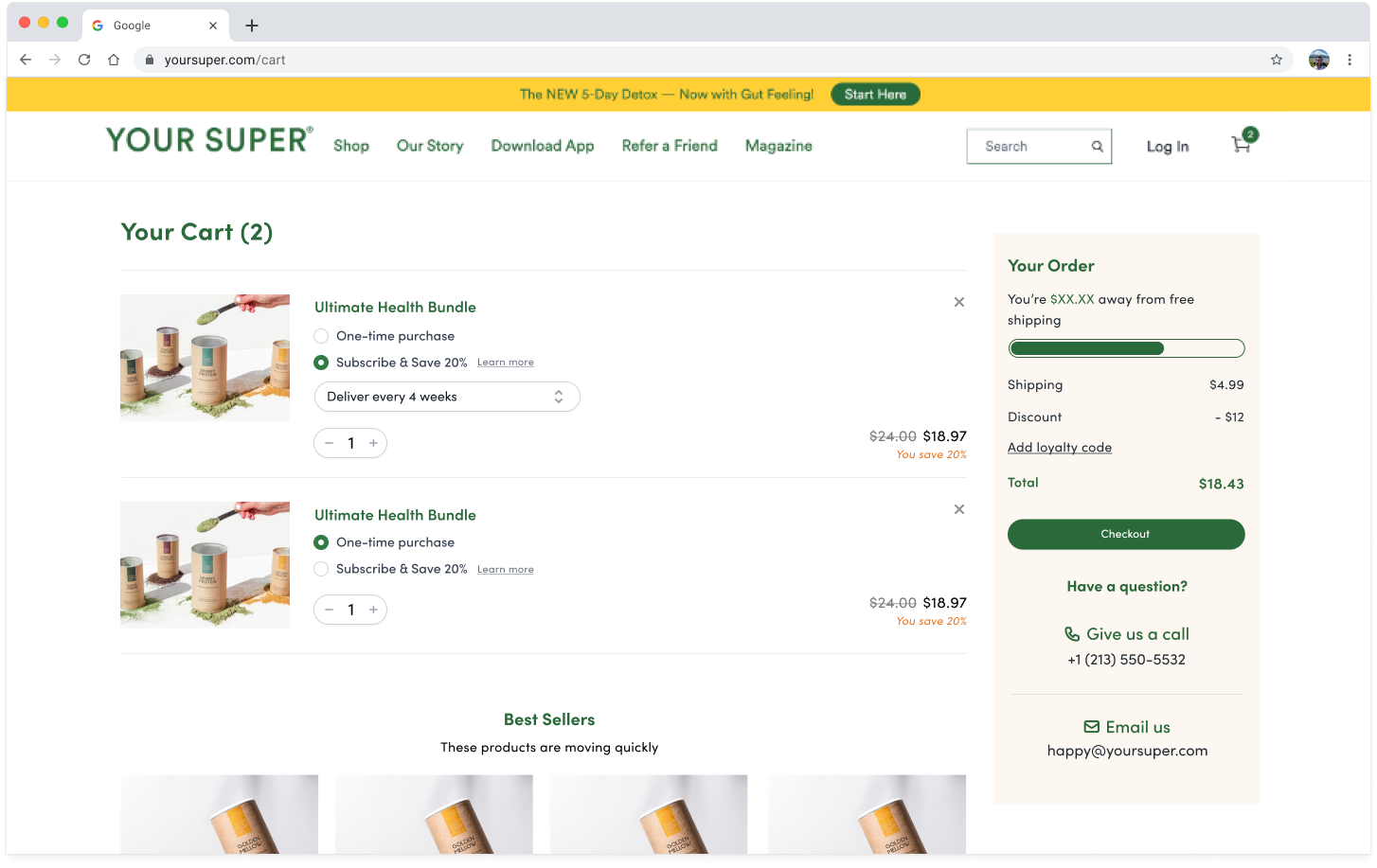
Checkout
To make better use of the space, I removed the middle gray column, made the product tiles wider, and removed the scroll so you could see all products at once.
Measuring Success
Not being integrated in the makes it hard to pull numbers but I was able to get a few data points from the project manager.
By the numbers
- Cancellations decreased by 25%
- 30 day churn rate decreased 2%
User Feedback
“OMG the new order page is SO MUCH BETTER. Before I dreaded going in and swapping out product because the site was so cumbersome and slow. This is far better! Also that you’re building “redeem” points (never could find them before. And that you have “add a product” to a subscription order... that one NEVER worked before.”