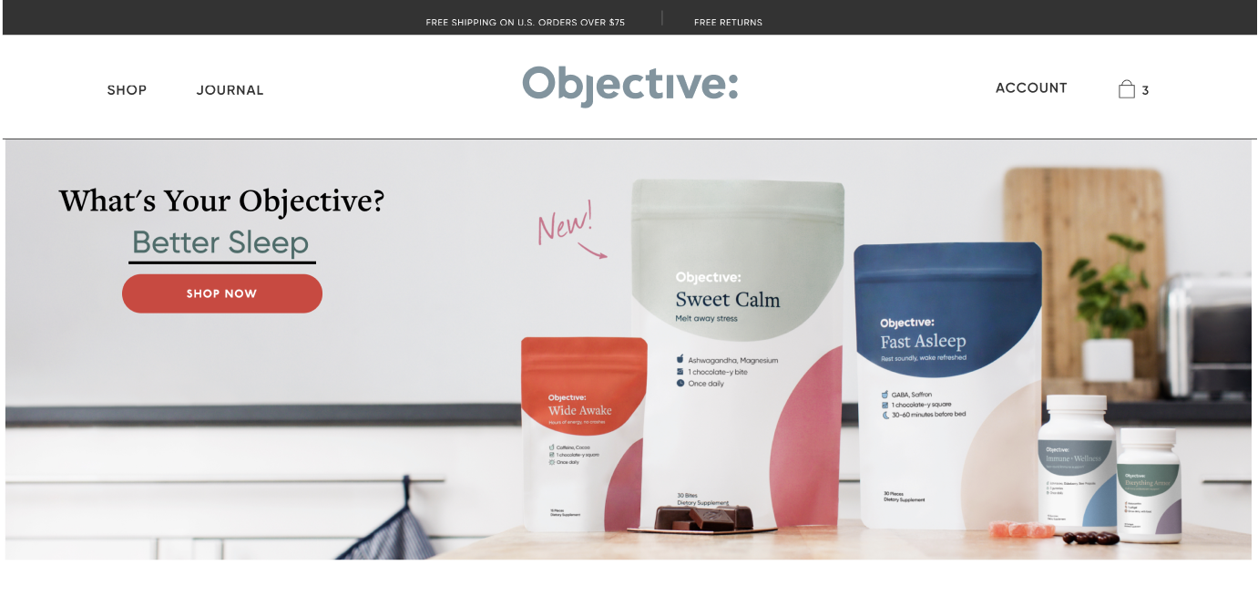
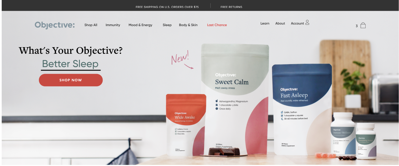
Objective is designed to take the work out of wellness—with solutions for every objective ( ).
).
Brandless is redefining what it means to be a brand through transparency, community building, and putting people first.
Year
2021
Skills
UI & UX
Wireframing
Prototyping
Year
2017-2019
Skills
Branding
Art Direction
UI & UX
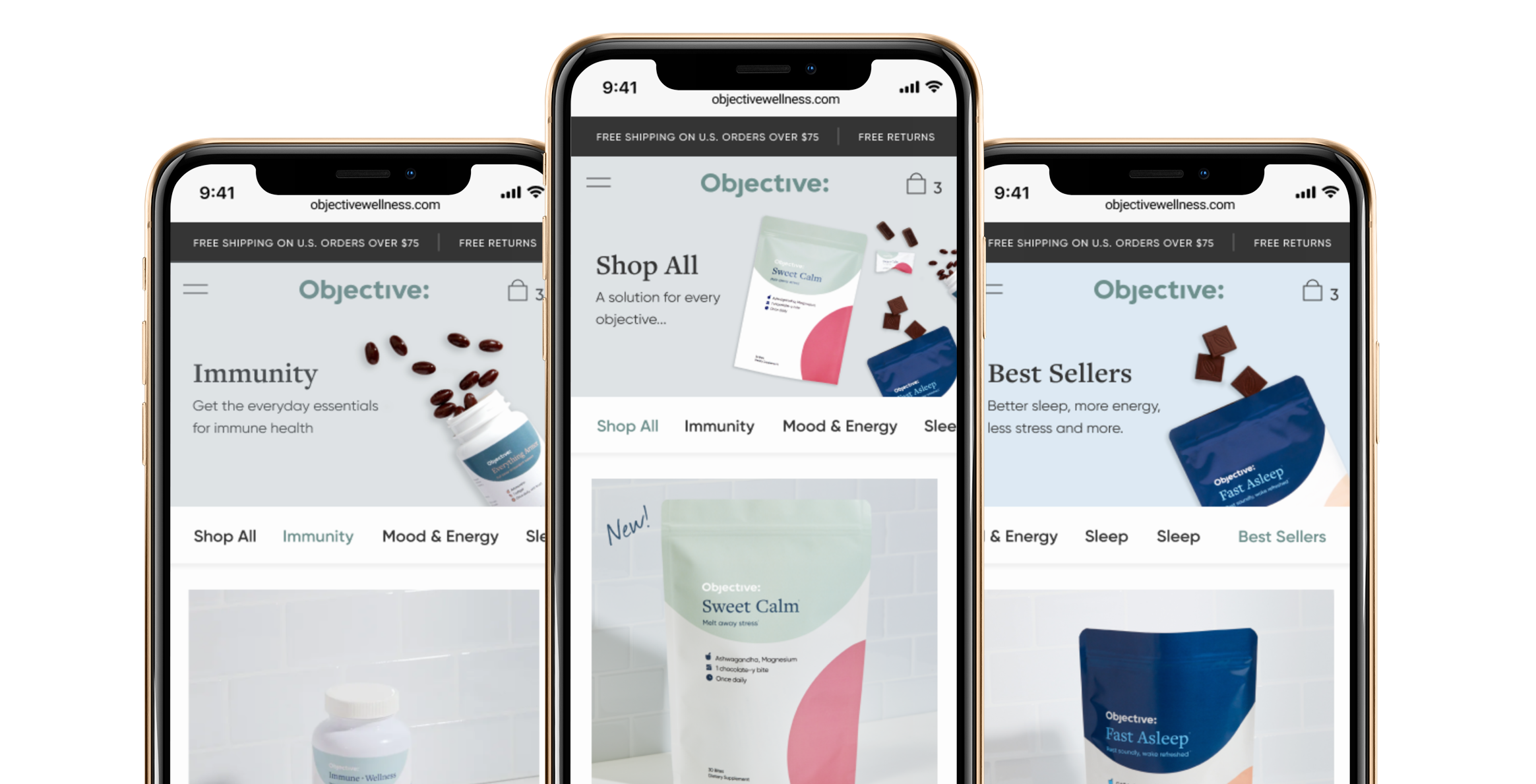
Objective is The Clorox Company’s first true Direct to Consumer brand built from scratch. I was the lead product designer to launch the site. Most ecommerce sites are built on Shopify, but we wanted to build our own headless ecommerce platform to support multiple Clorox brands. After launching the site one of the first projects we focused on was redesigning the navigation and category pages.
They make 'better-for-you' quality products more widely accessible and affordable for everyone. Life, liberty, and the pursuit of fairly priced everything.
As a Brand Designer at Brandless, my goal was to communicate the value and humanity of Brandless to foster connection & accessibility.
Usability testing
Post MVP launch, our UX researcher conducted usability tests to see where we could improve. They completed 12 total interviews of a mix of Objective customers and competitor customers. Some key takewaways were:
- Most were looking for a dropdown of categories
- Lack of clarity around the company and product assortment
- Not enough information about products from the gallery. Need to click in to get more info.
Problem Statement
Simple Fair Prices
Consumers are lost or unclear on products available and how they will benefit them.
Goals
- Improve discovery and customer journey
- Positive growth AOV, CVR (total > 1%)
- Decrease in bounce rate from gallery page
Brandless' business model cuts out the middleman and ships direct to consumers, removing the countless unnecessary steps between the supplier and a traditional retailer’s shelf. I helped design an infographic to illustrate the hidden extra costs that are involved with traditional CPG brands.

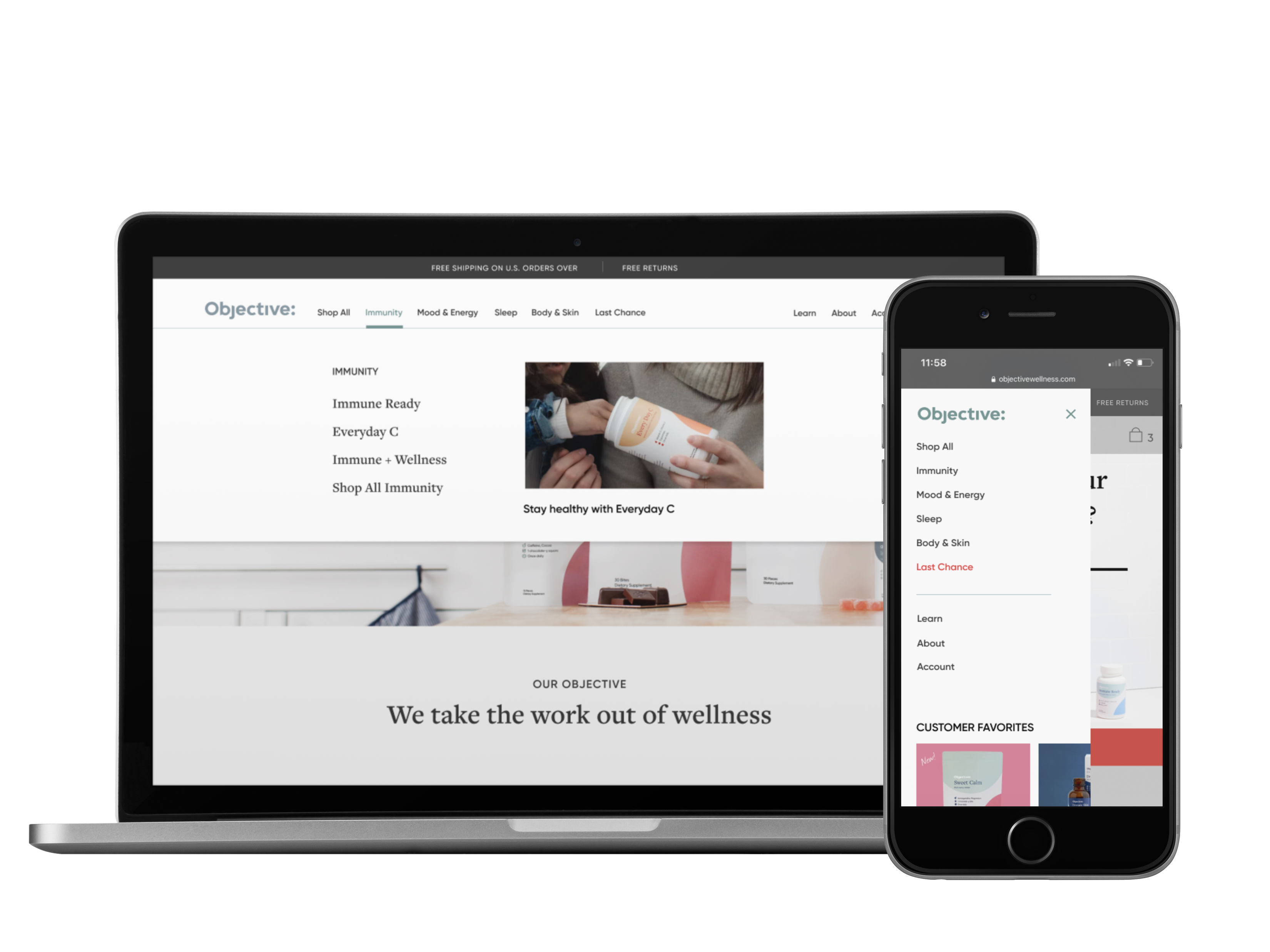
Updating the main navigation
The user flow with the old navigation involved clicking the shop button and scrolling through the different categories to find a product that interested the user. Not ideal, especially on mobile. In usability testing, many emphasized that the Shop button needs to have a drop down of categories. and that they didn’t like having to scroll down to discover the different categories.
I moved the logo to the left to utilize the ':' in the logo and adjusted the categories and links to match. Now it reads Objective: Shop All, Objective: Immunity, and adds to the brand narrative, which users said was lacking. Additionally, listing the categories in the main navigation instead of burying them under ‘Shop’ allows users to easily explore other categories without having to expose the subnav. An added benefit is that it helps them immediately understand the full scope of Objective and what it offers.
Adding Subnavigation
By adding subnavigation, users can now access product detail pages in one click. Previously it involved clicking ‘Shop all’ and scrolling till you found the product you were interested in and clicking into the PDP. We also added opportunities to merchandise the experience with promo slots that can be either 1-up or 2-up.
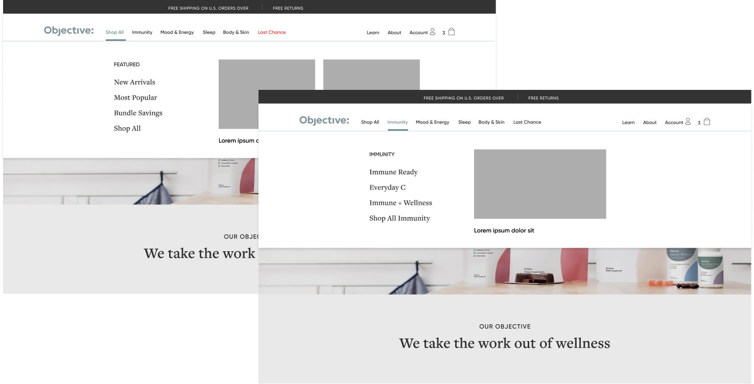
Flexible category pages
Our goal was to give the merchandise team as much flexibility without involving engineering. I created templatable category pages and a flexible nav so merchandising has the ability to test new categories or add new bundles and include them in the navigation.
Show AND tell
They say show don't tell. But I did a little of both. For the grid on the category pages I decreased the number of products per row to 3 to increase product image size. Then I added a rollover that flips to an image of the unpackaged product so they can see the form.
The old tiles didn’t have product descriptions and users tended to open up many tabs for different products and switch back and forth. I added a short description so users could understand the product benefits without clicking into the PDP. I also added testimonials and ad slots to insert in the grid and decreased the height of the hero image to bring more products above the fold.
Because the packaging is simple & understated, we wanted to show the freshness & realness of the product as a part of everyday life in the home. We depicted the products in use and added hints of context for scale.

Conclusion
Due to changing business objective's, we have not been able to prioritize this update. It's currently in the queue on the roadmap and will hopefully be updated soon.
More Work

Roveproduct design
BritaProduct Design
Your SuperProduct Design

BrandlessBranding | Art Direction
ShypBranding | Communication